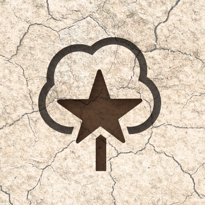


A new product name and logo created for a series of cotton seed varieties specifically marketed for dryland acres in the West Texas region. This dryland region is especially tough for cotton growers because of the lack precipitation and soil conditions. The name and logo reflects the attributes of the genetics used to create the seed, and highlights the geographical region to cotton farmers.
An event logo for a newly created annual bike ride that takes place on Memorial Day weekend. Riders bike from Clayton to New Haven, Missouri with the final destination being Lake Barclay. Creating this logo was much easier than doing the bike ride.
An event logo for Tony Larussa’s annual fundraiser for autism support. The theme name “It’s in the Cards,” was already selected by the committee before the logo was created. Using the shapes of two playing cards standing on end creates an advocacy shaped ‘A’ and highlights the heart underneath. Creating a safe and welcoming feel for the event look, while building on the equity of the former Cardinals manager for marketing materials.
An identity for a high-end hardscape company who specializes in custom stamped and dyed concrete and outdoor solutions. The simple type and stamped monogram was used as a repeating pattern for other marketing materials.
An event logo for (at the time) the newly revamped Walmart FLW bass fishing tour. We were tasked with utilizing the existing FLW typographic treatment, but I introduced a combination of a bass fish and hook lure shape to create a unique symbol. This logo has been featured on ESPN and all the event materials for the tour. After a few years the tour dropped the type and switched to using just the bass/hook symbol.
An event logo for the St. Louis hosting of the National Agri-Marketing Association fall conference. The conference was to highlight how the industry is changing and what marketers need to be doing to evolve with this change in the industry.